Hi, I’m Rob and in this post I will be blowing off about wordprocessors. Many users spend most of their life staring at a wordprocessor screen, either to read or to create documents. Its important that the text looks good on screen as well as in print. over the past [too many years to mention] I must have become friends with several dozen word processors and text editors, I have even tried to write a few. When I had to rebuild my PC I decided to try and break the mold. I wanted to try some of the free offerings before parting with hard cash for the latest $MS offering. I am not alone. Many years ago Sun Microsystems (then one of the world’s largest computer manufacturers) decided that rather than pay Mr Gates for a site licence for MS Word, it would be cheaper to put some of its many programmers to work to write their own wordprocessor. They started work back in 1995 with Star Office and, to let Mr Gates know what they thought of him, they released it for free as Open Office. So, 25 years on how well does open office stand up MS Word. I’m not talking about how many unused features it hasbut is it really a serious contender for run of the mill documents. Is there really any point in shelling out hundreds of pounds for Microsoft Office when there is functional equavalent available for free. Obviously 25 years is a long time for either party to improve a product but with all that cash MS have the edge in how much development effort they put in to develop the product. For many users, what we had 25 years ago was fine. We dont really need all the additional bloat.
Open Office has gone through a number of incarnations since it was born. Today (January 2020) the two main branches are Apache Open Office version 4.1.7 and Libre Office 6.3.4. Enthusiasts on the web will advise that Libre office is much better because it gets more updates. I’m not convinced. If its that good why does it need so many updates? One tangible difference is that Libre office claims to be more compaitible with MS Word because it can save as .docx files. Dig a little deeper and you wil find many .docx files can be opened with Apache Office and very few documents need the features the docx format allows. The real issue is how well does it deal with advanced features like headers, footers, floating pictures, and embedded diagrams. If you are interested in long, complex documents like trying to write a book, you are best advied to steer clear of Microsoft Word and docx format in the first place! Trying to control pagination and picture placement in Word will likely drive you mad.
First up lets see how Libre Office and MS Word shape up on a simple document. Here is some text written in both Liberation serif and Liberation san-serif. I chose Liberation font family because its the default for Libre office. I have cropped the page to make sure you see it at 100%:
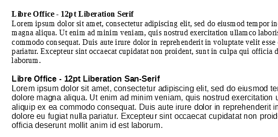
It’s not a pretty sight. The letter spacing is all uneven. In the heading row of both fonts the first two characters of the word ‘Libre’ are wrong. There is far too much gap between the ‘L’ and the ‘i’ and the ‘i’ is pressed hard against the ‘b’. This happens in both the Serif and san-serif variants. In the second line of the serif version, look at the word ‘magna’. The gap between the ‘m’ and the ‘a’ is too large and the ‘a’ is forced up against the ‘g’. Likewise, towards the end of the second line the word ‘ullamco’ could almost be two words. Its not. Its just the spacing between the ‘m’ and ‘c’ is too large.
Im not very familiar with the Liberation font. Perhaps there is a problem with the font on my setup. The exact details of how a font get rendered to the screen are very complex. I will make a more detailed investigation in a later post. For now lets compare how Libre Office and MS Word 2010 handle the Liberation font:
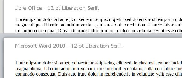
It should be immediately obvious the letter spacing is much more even in Word than Libre Office. The problems in the words ‘magna’ and ‘ullamco’ are resolved and I cant see any obvious problems.
So it looks like Libre Office and the Liberation font don’t rest well together. Now lets look at what happens when we use Cambria and Calibri. These fonts were designed by Microsoft especially for use with flat screeen displays and optimised for use with Microsoft’s font rendering system. First I compare Liberation Serif and Cambria in Libre office. Again I crop the image so you can see it at 100%. To my mind Libre Office does an acceptable job although Word is still the clear winner.
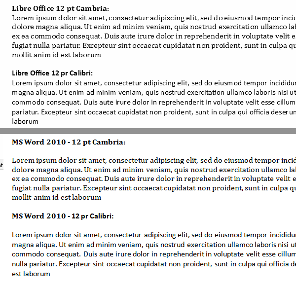
So far its looking as if Libre office is acceptable provided you dont use the Libration fonts. Now lets look at Apache Open Office. Libre office was forked from Open Office back in 2010. Since then Open Office became Apache office which is still under active development. Lets look at how that performs. Interestingly Open Office uses Times New Roman as its default font. This is one of the origial Microsoft fonts dating back to the dark days of 16bit Windows 3.1. Although it has had a numbert of updates, Cambria and Calibri are specifically designes for use with flat panel displays and so that is what I will test here:

For some reason, AOO renders the Liberation fonts better than Libre Office. Without doing a lot more research its hard to say why. I assume there are good reasons for Libre Office to have changed the font rendering code. It looks like their regression testing has failed to pick up these issues. One thing I noticed while researching this article is that the character pairs that have bad layout depend on the details of the characters that preceed them. It looks like some form of cumulative rounding errors in how the type is rendered. I will look at this in more detail in another post.
Conclusion: If you want to use Libre Office, use Calibri and Cambria fonts. Avoid the Liberation font. At time of writing it’s on screen appearance is terrible.
One point I should mention is that the above comments only apply to documenst rendered in the word processor. Use Libre Office to create a document in the Liberation font and ‘print’ to a pdf or paper and it looks fine.
Postscript
I did a lot of follow up work on this including downloading the source code and compiling it. The problem appears to be that internally Libre Office uses integer pixel positions when calculating how to position individual letters on the screen. While this may have been acceptable back in the days before flat screens and Cleartype, it is totally inadiquate for todays displays. Unfortunately the fix will require a very major rewrite of the graphics subsystem so dont expect a fix any time soon. Fortunately the problem is limited to the screen display. Printed output appears much better. You also generate decent quality PDF output. If it annoys you, best plan is to use Calibri and Cambria fonts that are optimised for Cleartype. Another option is a 4K screen, but that is a bit expensive .